CSS - Display & flex
inline, inline-block , block
| 屬性 | 換行 | 寬度 | 有Width, height屬性 |
|---|---|---|---|
| inline | 不換行 | 內容寬度 | 無 |
| inline-block | 內容寬度 | 不換行 | 有 |
| block | 換行 | 水平撐滿 | 有 |
- Display:inline 時width, height屬性不會有作用
flex, inline-flex
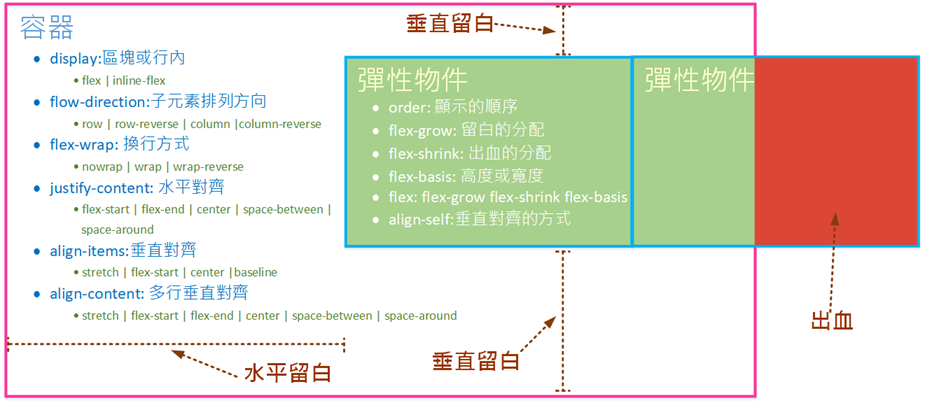
- 彈性容器(flex container): 外層
display:flex: 區塊彈性容器inline-flex: 行內彈性容器
flow-direction:子元素排列方向row: 左→右row-reverse: 右→左column: 上→下column-reverse: 下→上
flex-wrap: 內容超過1行時如何處理nowrap: 只有一行flex-shrink為預設值時,當內層的物件寬度超過容器時,會按比例縮小內層物件的寬度
wrap: 由上到下換行wrap-reverse: 由下到上換行
justify-content:水平對齊的方式(留白的位置)flex-start: 靠左對齊flex-end: 靠右對齊center: 置中space-between: 等寬(最左及最右不留白)space-around: 等寬(最左及最右留白)
align-items:垂直對齊的方式(垂直留白的處理)stretch: 自動填滿高度flex-start: 靠上對齊flex-end: 靠下對齊center: 垂直置中baseline: 基準線
align-content: 多行時垂直留白的處理stretch: 有設height時平均分配flex-start:內容在上面,留白在下面flex-end:內容在下面,留白在上面center: 內容在中間,留白在上下space-between:平均分配留白,最上、最下不留白space-around::平均分配留白,最上、最下留白為中間留白的一半
- 彈性物件 : 內層
- 留白: 內層比外層小時,空白的部分
- 出血: 內層比外層大時,超出的部分
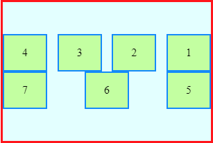
order: 顯示的順序- 預設值為0
- 依原始碼的順序顯示
- 沒有設定時(全部都為預設值0)
- 有2個以上數字相同時
flex-grow: 將留白按比例分配給內層元素- 當寬度為滿版時 ⇒ 沒有留白 ⇒ 可以直接使用
flex-grow切版 #item1 { flex-grow:1; }: 1/3留白分配給item1#item2 { flex-grow:2; }: 2/3留白分配給item2
- 當寬度為滿版時 ⇒ 沒有留白 ⇒ 可以直接使用
flex-shrink: 將出血的部分按比例縮小內層元素,預設為1,0為不縮小#item1 { flex-shrink:1; }: 1/3出血分配給item1#item2 { flex-shrink:2; }: 2/3出血分配給item2
flex-basis: 高度或寬度,優先權較height, width高- 在容器
flow-direction:row時,flex-basis為寬度 - 在容器
flow-direction:column時,flex-basis為高度
- 在容器
flex: 一次指定flex-grow,flex-shrink,flex-basis3個參數flex-grow flex-shrink flex-basis
align-self: 垂直對齊的方式,優先權比容器的align-items高- 有少數彈性物件不使用容器
align-items設定的垂直對齊方式時使用
- 有少數彈性物件不使用容器
Flex Example 1
#container {
  display: flex;
  flex-direction: row-reverse;
  flex-wrap: wrap;
  justify-content: space-between;
  align-items: flex-start;
  align-content: center;
}
#container>div{
  order: 0;
  flex-grow: 0;
  flex-shrink: 0;
  flex-basis: 60px;
  align-self: flex-end;
}
Flex Example 2
.container {
display: flex;
flex-direction: row;
flex-wrap: wrap;
}
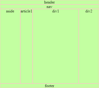
header { flex-basis: 100%; }
nav { flex-basis: 100%; }
/* 用flex-basis切版 */
aside {flex-basis: 20%; height: 300px; }
article {flex-basis: 20%: height: 300px; }
/* 用flex-grow切版 */
.div1 { flex-grow: 3; }
.div2 { flex-grow: 1; }
footer { flex-basis: 100%; }
flex 置中
.flexCenter {
  display: flex;
  justify-content: center;
  align-items: center;
}